Interface to create reports in Alasco SaaS
Alasco is a Munich-based startup that provides cloud based solution to digitalize the processes in construction planning and execution. Their SaaS service is growing and providing their customers more possibilities.
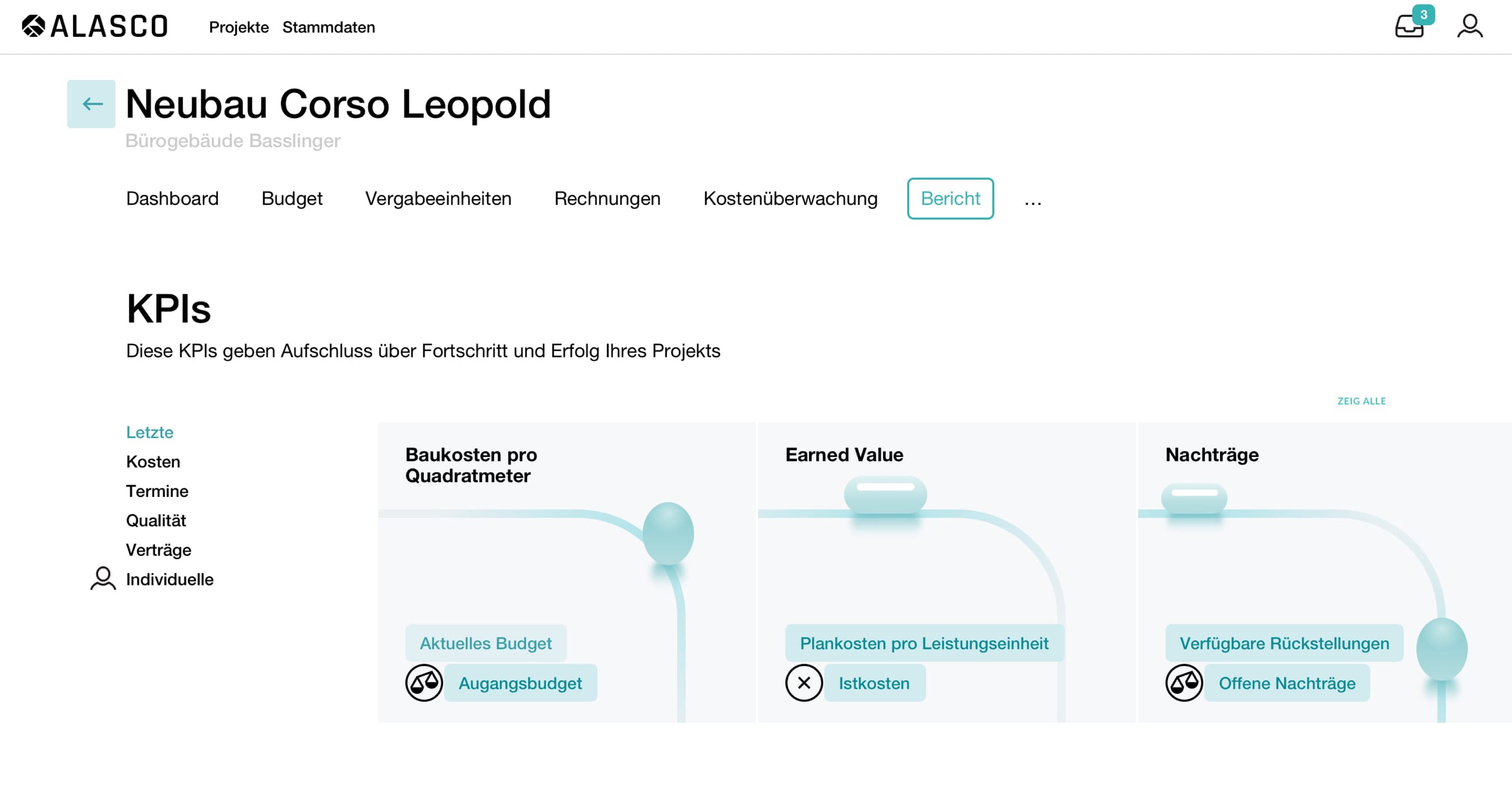
Our task was to design "Reports" section where users can calculate KPIs.
The result displays herritage of design language of the rest of the system and follows to user-oriented approach.
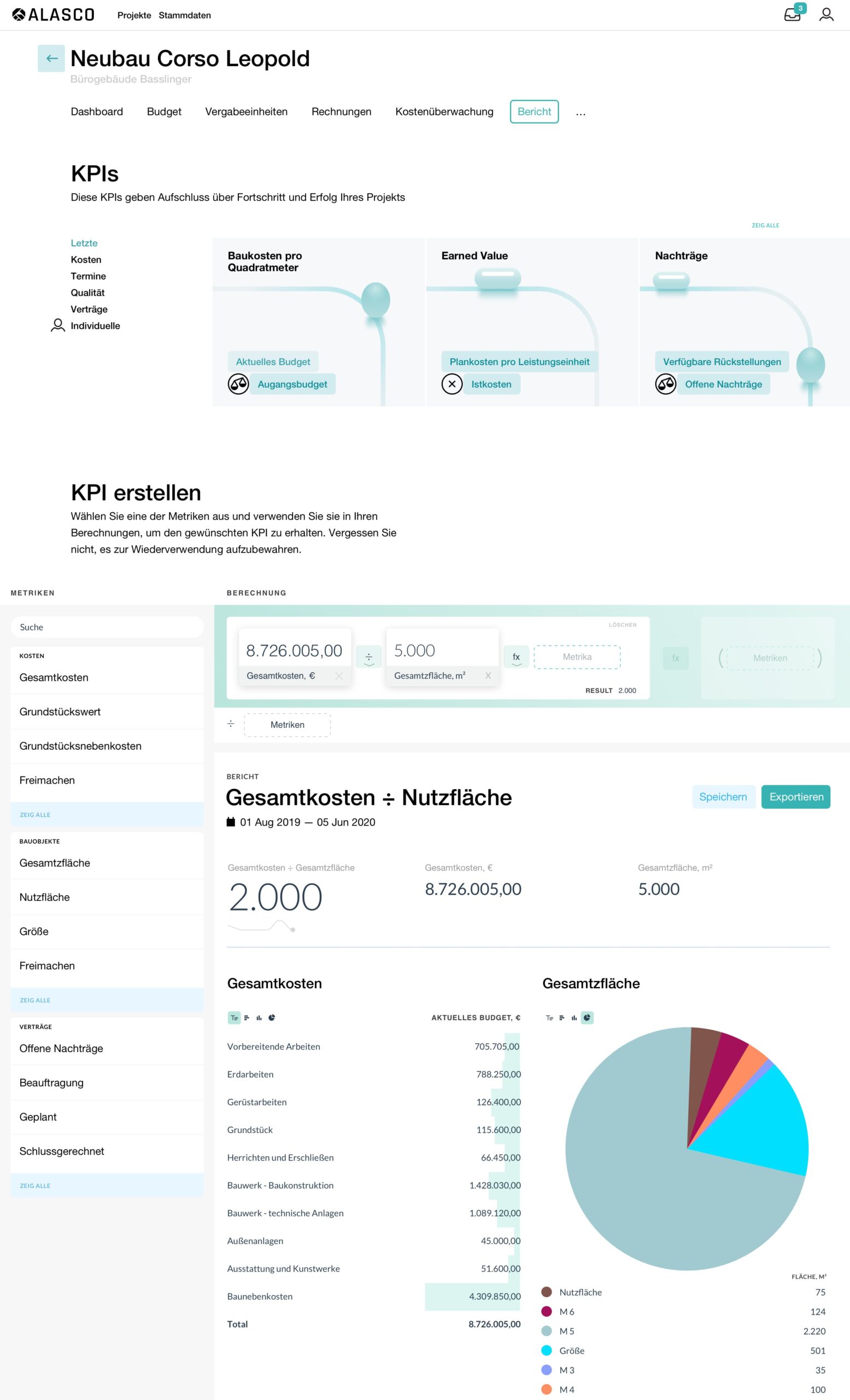
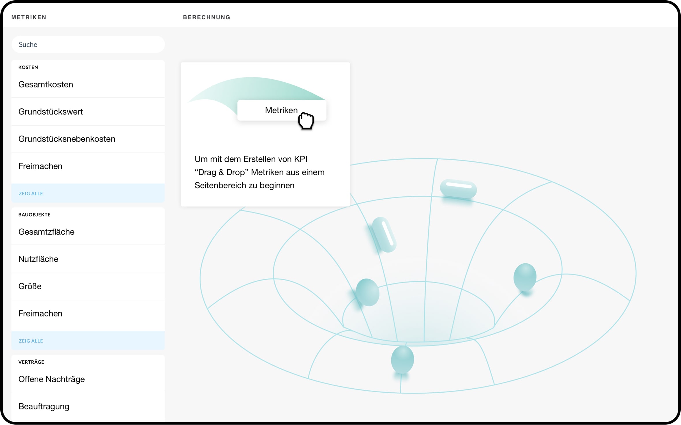
Library of pre-created KPIs serves as a quick onboarding to a new functions. Drag&drop interface is used to support creation of even complex calculation with ease.
Many systems providing interface to create any sort of calculations often it goes at expense of user-friendly interface. Knowing we can do better we used well familiar drag and drop interaction where users can drop in needed ingredients to get needed result.
Interface to create reports in Alasco SaaS
Alasco is a Munich-based startup that provides cloud based solution to digitalize the processes in construction planning and execution. Their SaaS service is growing and providing their customers more possibilities.
Our task was to design "Reports" section where users can calculate KPIs.
The result displays herritage of design language of the rest of the system and follows to user-oriented approach.
Library of pre-created KPIs serves as a quick onboarding to a new functions. Drag&drop interface is used to support creation of even complex calculation with ease.
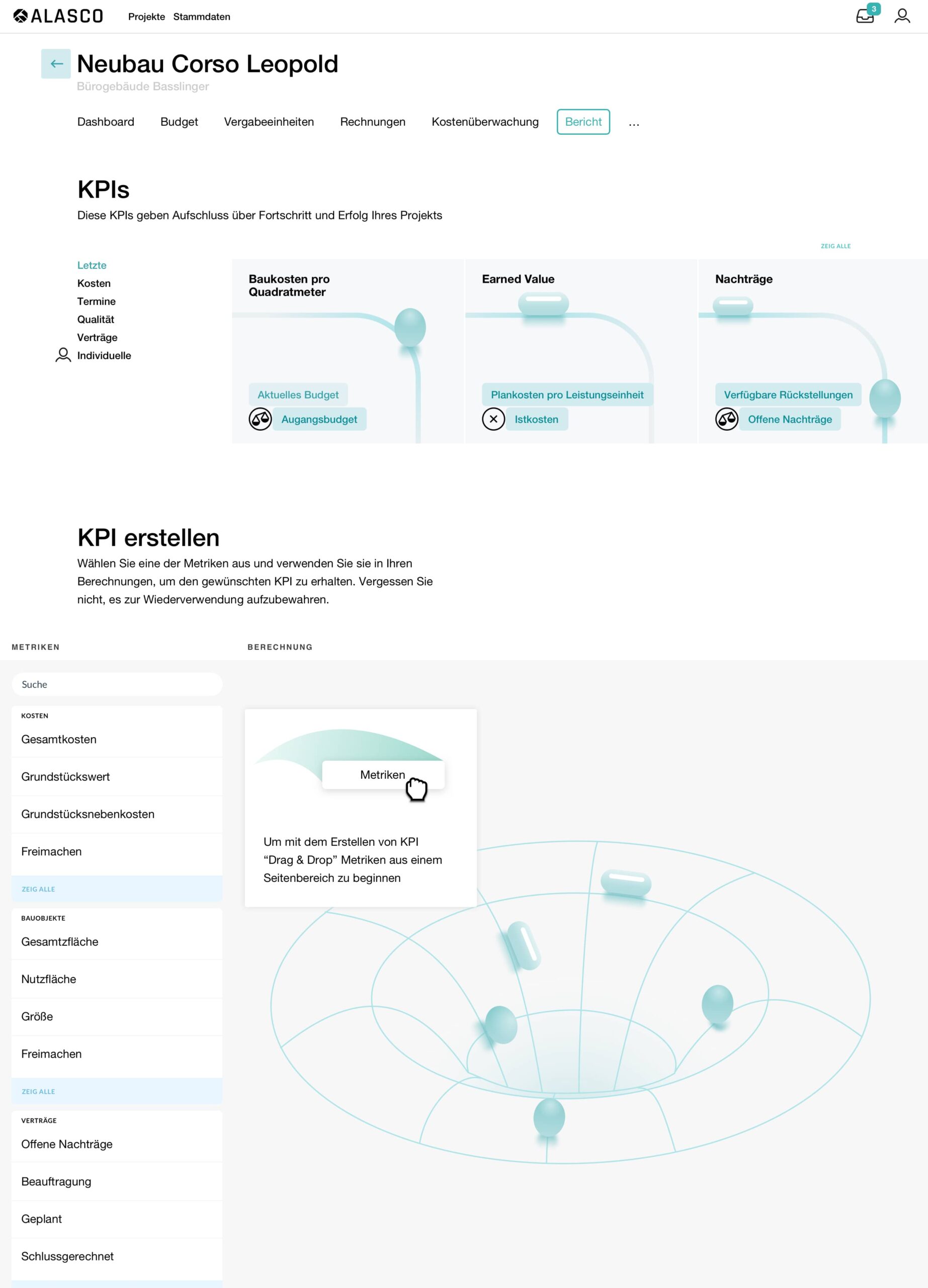
First of diving into the world of construction and exploring how KPIs are helpful. Considering current and potential users to make the new section beneficial for them. Carefully fixing All ideas from brainstorming session and testing them during wireframe process.

Strategy
What we were aiming for is to have our solution effortless to use yet provide possibility to create complex calculations. "Reports" is a new section of Alasko's SaaS solution. When introducing such a change we need to think how to make onboarding process as smooth as possible to make sure users will give it a try and benefit from extension of functionality.
The new section starting with predefined KPIs that will make calculation in one click. Users can not only easily get new perspective on their project but can adjust predefined calculation to their needs and save for later reuse.
Hey there, this is the default text for a new paragraph. Feel free to edit this paragraph by clicking on the yellow edit icon. After you are done just click on the yellow checkmark button on the top right. Have Fun!
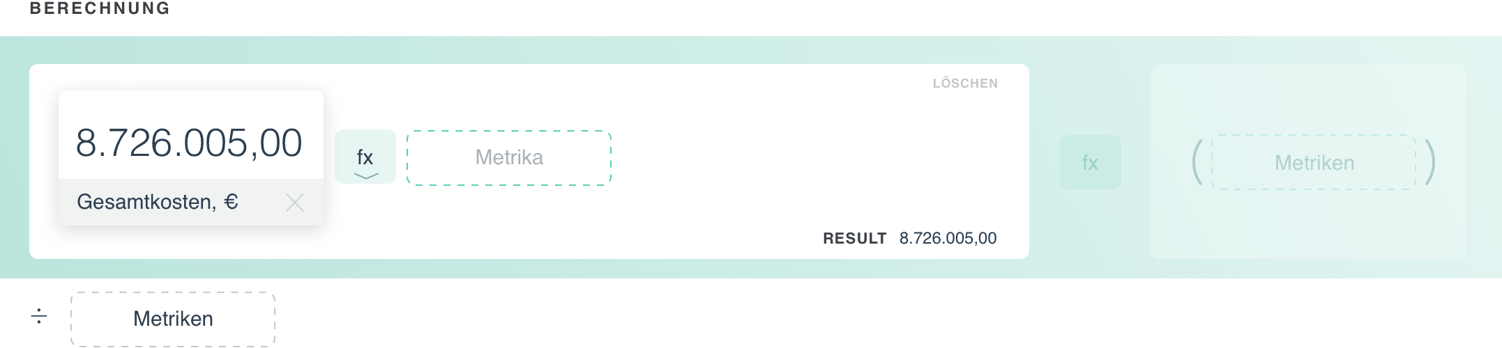
Added metrics showing the value behind it. We need to add at least one more metric.
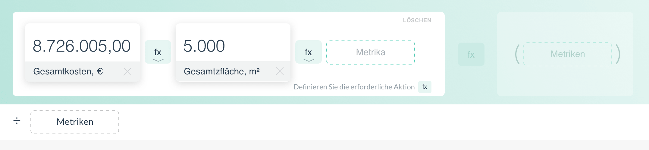
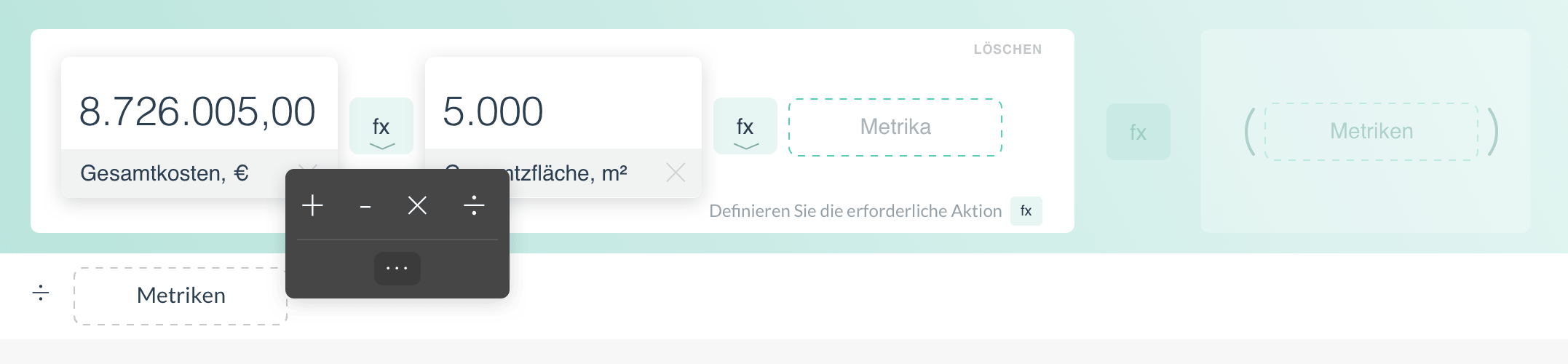
We can keep adding more metrics or select needed operation and get first result. Fx icon between metrics is for selecting operation. It is limited down to basic operations if you need extended list it is available under "..." icon.
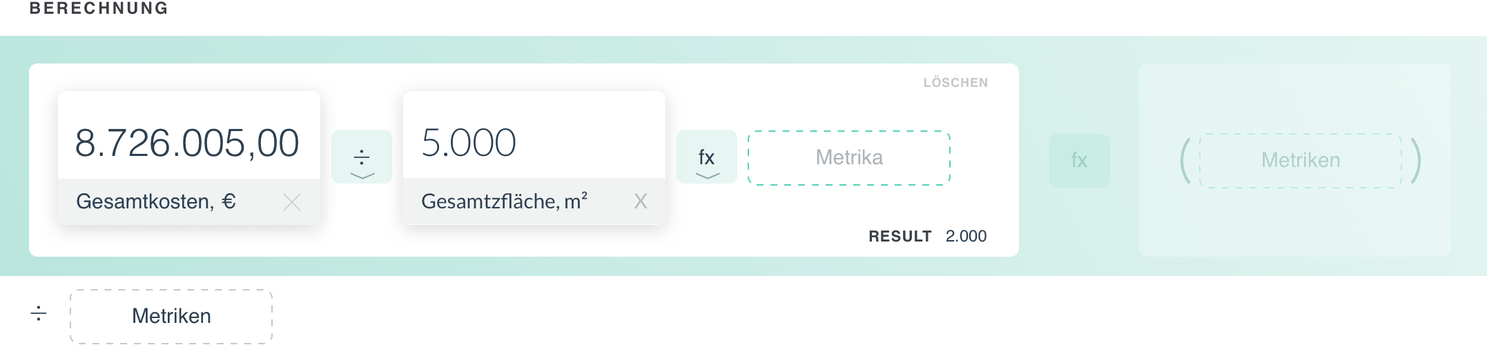
Congrats you have your first result. Users can make the calculation including more metrics if needed that will help you to get more detailed information about your project or even show you hidden dependencies.
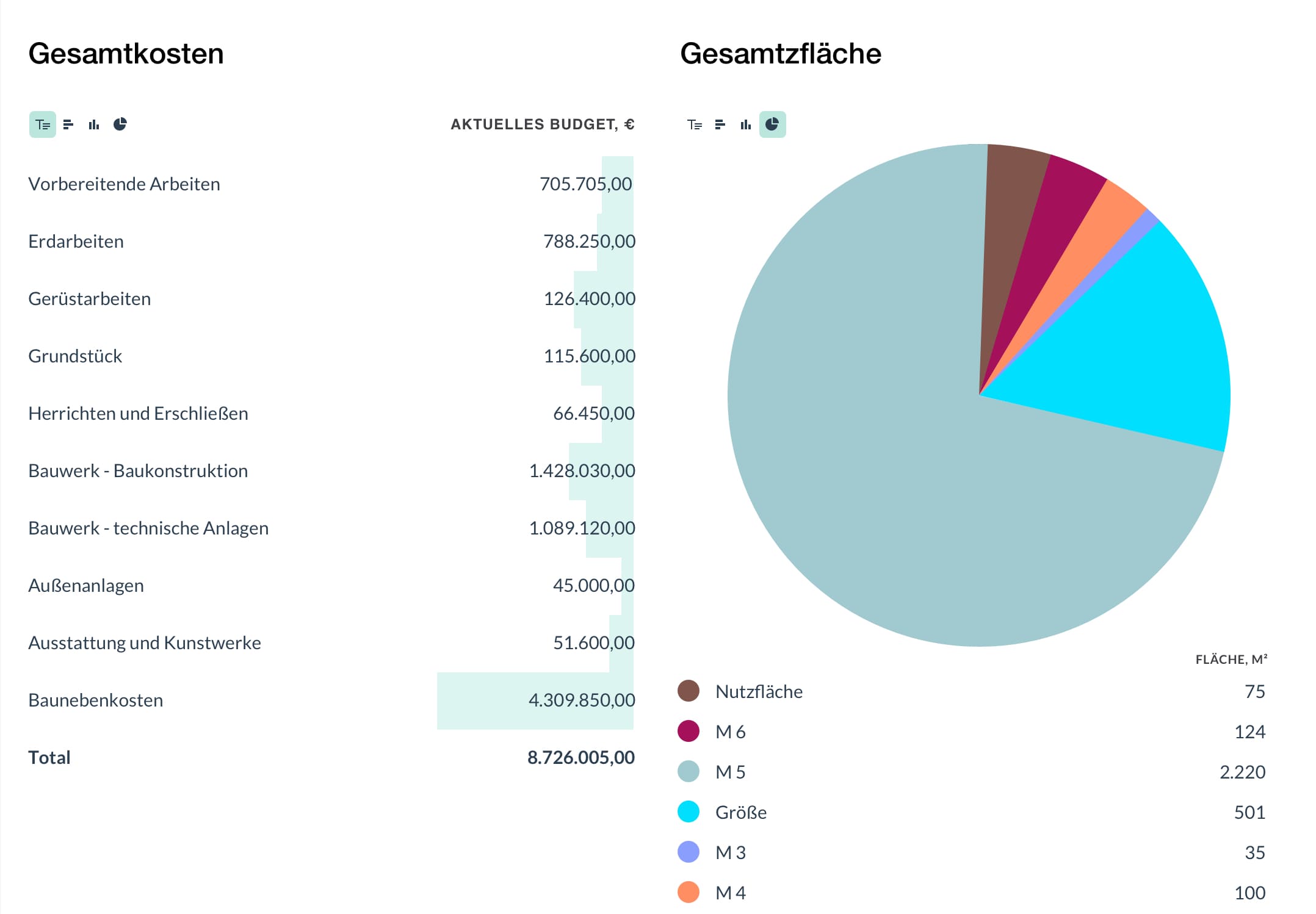
Working with data
Every metric consist of several values by default they are shown as table. Colored bars below number showing how big is that number considering other numbers from the same metric. Users can toggle between other visualisations to get a better representation of the data.